Navy Kitchen Ideas: Blue, Teal and Cobalt Cabinet Designs
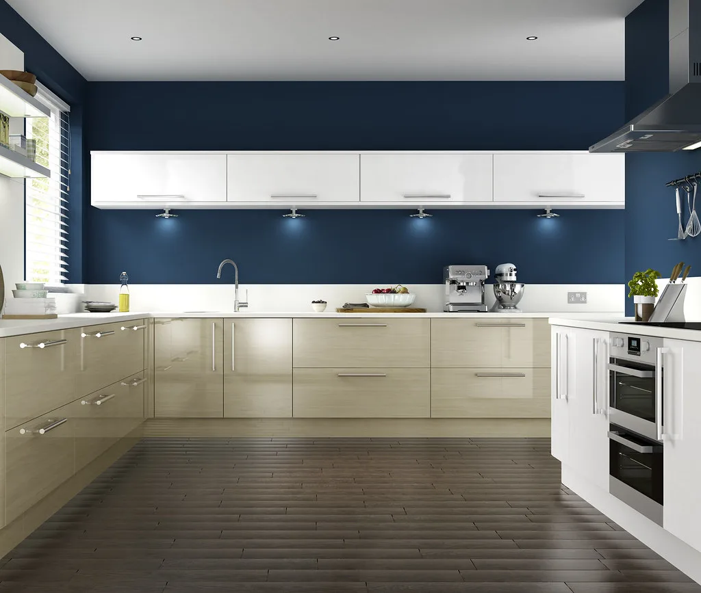
A navy kitchen has quietly become the default for anyone who wants something warmer than grey and more grown-up than white. Blue is the colour designers keep specifying because it behaves like a neutral while still having presence: it flatters brass and oak, it hides everyday marks better than pale paint, and it suits both a period London house and a new-build extension. This guide covers the blue kitchen ideas actually worth copying in 2026, which shades earn their place, and the worktop and hardware choices that decide whether the result looks considered or like a fad.
Choosing the right blue
The mistake people make is treating “blue” as one decision. In practice there are three families, and they do very different jobs.
Navy and inky dark blues are the safest and most popular. A deep, slightly warm navy reads almost as a neutral, works on full cabinetry or just an island, and dates far more slowly than a bright shade. Well-loved paints in this territory include Farrow & Ball’s Hague Blue and Stiffkey Blue, and Benjamin Moore’s Hale Navy, all chosen for their balance of warm and cool undertones. If you want one blue you will not tire of, start here.
Teal and blue-greens sit between blue and the sage tones that have been so popular, which makes them a natural next step if green feels overdone. Teal brings a bit more life than navy while staying easy to live with, and it looks especially good against warm wood and aged brass.
Cobalt and brighter blues are the statement option. They add real personality but demand restraint: use them on an island, a run of lower units or a dresser rather than wrapping the whole room, and pair them with plenty of neutral to let the colour breathe.
Layering blues for depth
One clear direction for 2026 is layering rather than a single flat colour. Combining a lighter and a darker blue, for example a pale blue-grey on the walls or upper units with a deep navy below, gives a kitchen depth and a sense of luxury that one shade cannot. The same logic drives the enduring two-tone look: navy base units and island with white or pale upper cabinetry keeps a smaller kitchen feeling light while grounding it in colour. As a rule, put the darker blue low and the lighter tone high, so the room feels anchored rather than top-heavy.
Worktops and splashbacks that lift navy
Navy needs the right worktop or it can feel heavy. The reliable pairings are a white or pale stone, quartz or marble-effect surface, which brightens the scheme and keeps it airy, or a warm-veined natural stone that stops the contrast feeling stark. Timber worktops in oak or walnut are the other strong move, adding warmth that cool navy lacks. Avoid a very dark worktop against dark navy units unless the room has generous natural light, or the whole space closes in.
Hardware: the detail that sets the tone
Hardware is where a blue kitchen earns its polish. Brass and unlacquered brass are the standout choice against navy, giving an upscale, refined contrast that has become a signature of the look. Aged or antique brass suits a period property; polished brass or gold reads more contemporary. Black hardware gives a sharper, more modern feel, while chrome keeps things quiet. Whichever you choose, carry it through taps and lighting so the metals agree.
Making it work in a real project
Blue is forgiving, but a full kitchen in the wrong shade is an expensive mistake to undo, so test large paint samples on the actual cabinetry in your own light before committing, and look at them morning and evening. Undertones shift dramatically between a north-facing London kitchen and a bright south-facing extension. For a lower-risk route, paint an island or a dresser blue and keep the rest neutral; you get the effect for a fraction of the cost and commitment.
If a blue kitchen is part of a wider renovation, it helps to know the numbers before you brief anyone. Our new kitchen cost guide sets out realistic budgets, and the renovation cost calculator gives you a working figure for the whole project. For other colour directions, compare our grey kitchen ideas and red kitchen ideas. If you want a professional eye on the scheme, our guide to interior designer fees explains what that costs. For the technical side of durable cabinet paint, the Farrow & Ball colour guidance is a useful reference on undertones.
Frequently asked questions
Is a navy kitchen a good idea? Yes, for most homes. Navy behaves almost like a neutral, flatters brass and wood, hides marks better than pale paint, and suits both period and modern properties. It also dates far more slowly than brighter colours, which makes it a sensible choice for permanent cabinetry rather than a passing trend.
What colour worktop goes with a navy kitchen? White or pale stone, quartz and marble-effect surfaces work best, because they brighten the scheme and keep it airy. Warm-veined natural stone softens the contrast, and oak or walnut timber adds warmth. Avoid a very dark worktop against navy unless the kitchen has strong natural light.
What hardware looks best with navy cabinets? Brass and gold give the most upscale, refined contrast and are the classic pairing with navy. Aged brass suits older homes, polished brass or gold feels more modern, black hardware is sharper and contemporary, and chrome is the quietest option. Keep taps and light fittings in the same metal for a cohesive look.
Will a navy kitchen make a small room look smaller? Not if you handle it well. In a small kitchen, use navy on the lower units or island and keep upper cabinetry and walls pale, which grounds the room without darkening it. Lighter blues also work well in compact spaces, while the deepest navies suit larger rooms or those with plenty of light.
Is navy still on trend for kitchens in 2026? Yes. Blue in general and navy in particular remain among the most specified kitchen colours, with a move towards layering lighter and darker blues for depth. Because navy reads as a near-neutral, it has largely graduated from trend to a lasting classic.
The Folio
Want more like this in your inbox?
One considered idea for your London home, every Thursday.
SubscribeMore from KDS London
All guides
How Much Does an Interior Designer Cost in London in 2026?
What interior designers charge in London in 2026: hourly rates, day rates, per-room fees and percentage models, with real figures and what each one buys you.
Read
Gold and Brass Bathroom Accessories: How to Style Warm Metallics
How to choose and style gold bathroom accessories and brass fittings, from brushed vs polished finishes to mixing metals and avoiding tarnish.
Read
Green Bedroom Design Ideas: Shades, Furniture, and Styling
Green bedroom design ideas for a calm, grounded room: choosing sage, olive or forest shades, pairing furniture and metals, and styling green that lasts.
Read