Kitchen Colour Ideas: The Best Shades for Every Style
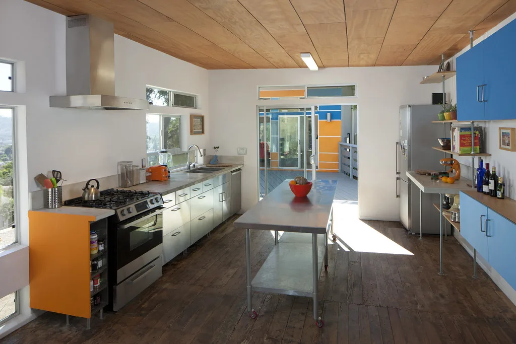
The best kitchen colour ideas are not the ones trending hardest on social media; they are the ones that still look right to you in five years, in your light, with your cabinets. Colour is the cheapest way to transform a kitchen and the easiest to get wrong, because a shade that sings in a showroom can fall flat in a north-facing London flat. This guide runs through the palettes worth considering in 2026, what each one does to a room, and how to combine them so the finished kitchen feels considered rather than copied.
Start with your light, not the trend
Before any colour goes on a sample board, look at how light moves through the room. North-facing kitchens get cool, blue-tinged daylight, so warm shades (creams, soft greens, terracotta accents) counteract the chill. South and west-facing rooms take cooler, deeper colours happily because the warm light balances them. Always test large sample patches on more than one wall and look at them morning, midday and under your evening lights before committing. Paint dries darker than it looks wet, and artificial light shifts every colour.
Warm neutrals: the safe canvas done well
Neutrals dominate 2026, but the mood has moved from cold grey to warm, softer whites and putties. Pantone named Cloud Dancer its Colour of the Year, a gentle off-white with just enough warmth to feel welcoming rather than clinical. Warm neutrals work because they let your worktops, splashback and hardware do the talking, and they never date. If plain grey has started to feel flat, our grey kitchen ideas guide shows how to warm it up with wood and brass rather than abandon it.
The risk with neutrals is blandness. Avoid it by layering texture: a timber worktop, a handmade tile splashback, unlacquered brass handles. Warm minimalism, the defining look of the year, is simple and uncluttered but never sterile.
Greens: still the favourite, now softer
Green remains the most popular non-neutral kitchen colour, but the loud emerald of a few years ago has given way to muted, organic shades: sage, olive, eucalyptus, moss and soft khaki. These greens sit beautifully with oak, brass and stone because they echo the outdoors, which is exactly why they feel calming in a busy kitchen. Sage in particular flatters both traditional shaker and pared-back modern doors, making it one of the most versatile choices you can make.
If you want green without committing the whole room, paint an island or the base units and keep wall units pale.
Blues: from soft to dramatic
Blue is the other perennial, and in 2026 it splits two ways. Soft, chalky blues create a fresh, coastal calm and pair well with white and natural wood. Deep navy and inky blues, meanwhile, are having a moment as a luxurious, grounding choice, especially on an island or a run of tall cabinets. Navy reads as sophisticated rather than cold when you warm it with brass or gold hardware and a wood or marble-effect worktop. Our blue kitchen ideas guide covers navy, teal and cobalt in detail.
Deep and dramatic: reds, plums and near-black
For those who want character, deep hues are back: rich reds, plums, wine and burgundy tones, and near-black charcoals. These are bold choices best used with restraint, on a single wall of cabinetry, a pantry, or an island, so the drama has somewhere to breathe. Balance them with plenty of neutral surfaces and good lighting, or a small kitchen can feel closed in. If a full red scheme tempts you, read our red kitchen ideas first for how to keep it warm rather than overwhelming.
The two-tone cabinet trick
The single most useful colour idea of the year is not a colour at all but a technique: two-tone cabinets. Put the darker, grounding shade on the base units and a paler shade on the wall units. This visually lowers the room’s centre of gravity, hides the inevitable scuffs near the floor, and makes a small or low-ceilinged kitchen feel taller and lighter. It is also a low-risk way to use a bold colour, because you are only committing to it at eye level and below. Pick two shades from the same undertone family so they read as a deliberate pairing rather than a compromise.
Putting a scheme together
A kitchen that looks designed usually follows a simple rhythm: one dominant colour across most of the cabinetry, one supporting colour or natural material (wood, stone, brass), and one small accent. Resist the urge to use everything you like in one room. If you are working with a professional, colour is one of the first things a good designer will pin down, because it drives the worktop, splashback and flooring choices that follow; our guide to the interior design process explains how that sequence works, and how much a new kitchen costs in the UK sets the budget context. Choose for your light, your home and your own taste, and the trend takes care of itself.
Frequently asked questions
What is the most popular kitchen colour in 2026? Warm neutrals lead, with soft off-whites like Pantone’s Cloud Dancer setting the tone, followed closely by muted greens such as sage and olive. Deep navy blue is the strongest bold choice, especially on islands.
What colour makes a small kitchen look bigger? Pale, warm shades reflect the most light and open up a small kitchen, especially on wall units. The two-tone approach, with a darker base and lighter wall units, also makes a compact room feel taller without losing all colour.
Are grey kitchens out of style? Not out, but evolving. Cold, flat grey has fallen from favour, while warmer greiges and grey-greens remain popular. Warming a grey scheme with wood, brass and softer lighting keeps it current.
What colour should I paint if my kitchen is dark or north-facing? Choose warm shades to counteract the cool northern light: creamy whites, warm greens, soft terracotta accents and honeyed woods. Avoid cold blue-greys, which can look grey and lifeless in that light.
How do I choose two colours for two-tone cabinets? Pick both shades from the same undertone family, for example a deep sage base with a soft sage-white above, so they clearly belong together. Put the darker colour on the base units and the paler one on the wall units.
The Folio
Want more like this in your inbox?
One considered idea for your London home, every Thursday.
SubscribeMore from KDS London
All guides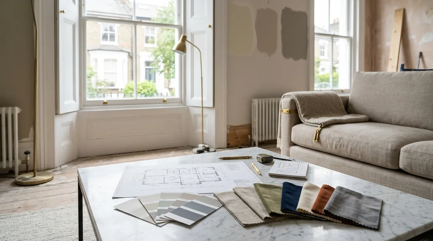
How Much Does an Interior Designer Cost in London in 2026?
What interior designers charge in London in 2026: hourly rates, day rates, per-room fees and percentage models, with real figures and what each one buys you.
Read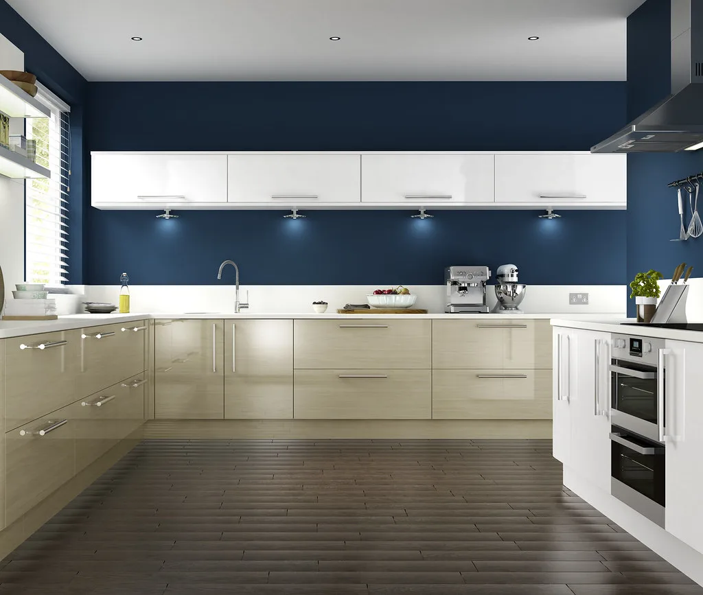
Navy Kitchen Ideas: Blue, Teal and Cobalt Cabinet Designs
Navy kitchen ideas that work: the best blue cabinet shades, worktop and hardware pairings, and how to use navy, teal and cobalt without dating the room.
Read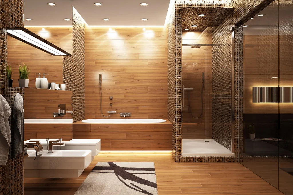
Gold and Brass Bathroom Accessories: How to Style Warm Metallics
How to choose and style gold bathroom accessories and brass fittings, from brushed vs polished finishes to mixing metals and avoiding tarnish.
Read